Case study
Loader research
Test how users perceive loading times when presented with different indicators.
- When
- September 2021
- Length
- 2 weeks
- Role
- Designer and researcher
- Team
- Myself
Define
When faced with a content platform that takes time to load, how does the design system team define which loading indicators to use and when?
I set out to do just that by creating a Framer test that would gather usage data from a prototype and send that data to a Supabase database.
Ideate
I met with two designers from different app areas to ideate and understand their needs.
We decided there were a few types of loading indicator that would be needed in various parts of the Seismic app. Including: skeleton placeholders, spinners, animated illustrations, and linear bars.
We did not know which visual treatment to give to the indeterminate loading states, and since we had a few options I suggested we user test it.
Build
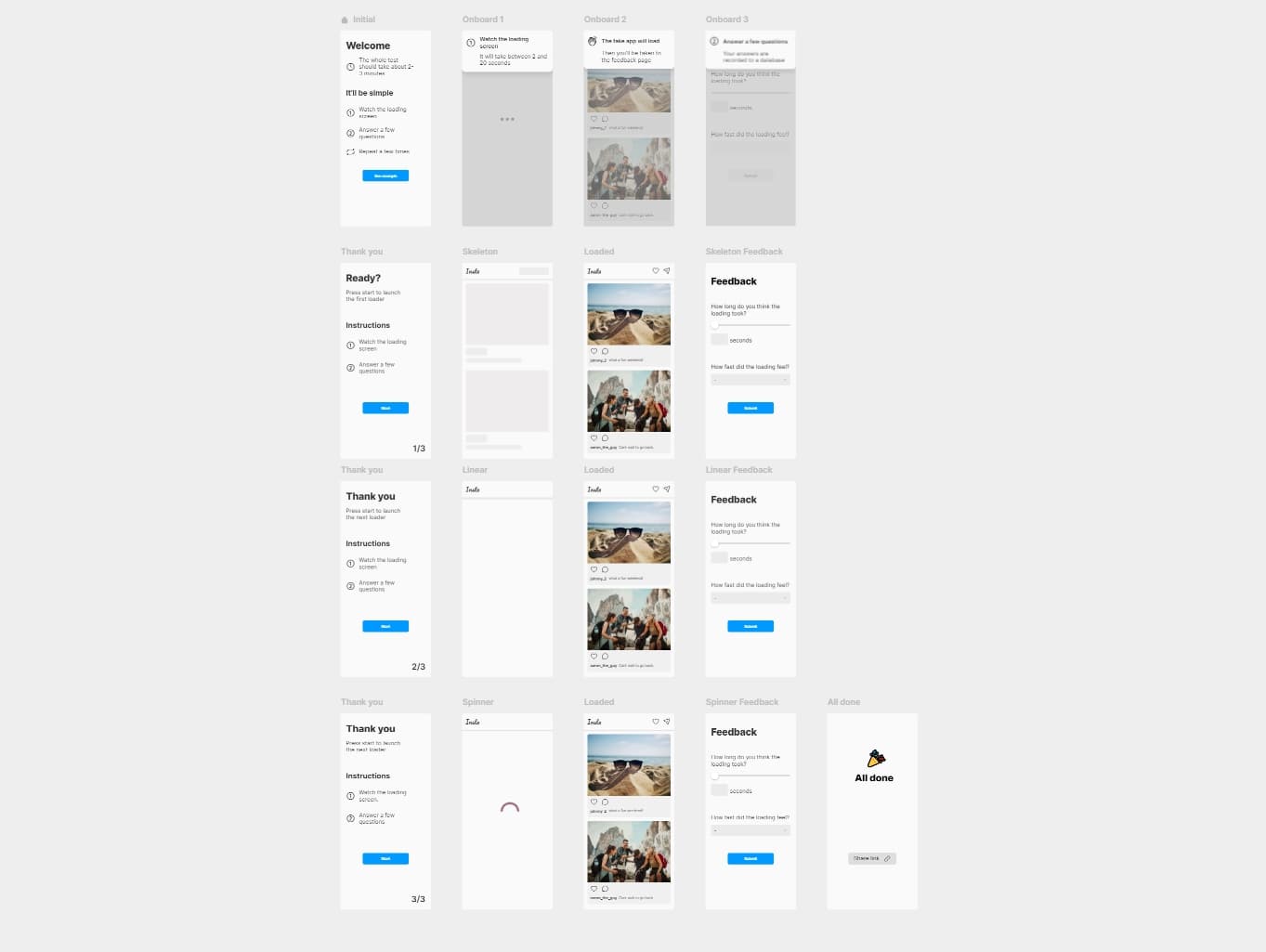
Jumping into Framer I set up a mock UI with a simple loading pattern. Then I duplicated that flow for each of the indicator types I wanted to test: skeleton, spinner, linear bar.
Using Framer's code overrides I was able to make the time with which the loader appeared random between 2 and 30 seconds. After the loader finished I used overrides to gather user feedback on how long they thought the loading took. After that, the actual time and perceived time were sent to a Supabase database.
View the finished project on the Framer Showcase
Results
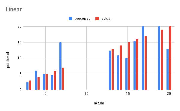
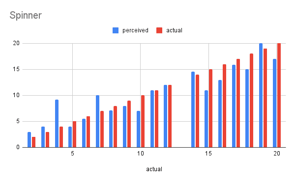
Out of about 50 tests users perceived the linear indicator as faster than the actual time.
However, since this test was unpaid I could not guarantee that users would take all three. Resulting in the linear test receiving nearly half of the responses that skeleton did. I will touch more on what I would change to prevent this in the 'Lookback' section below.
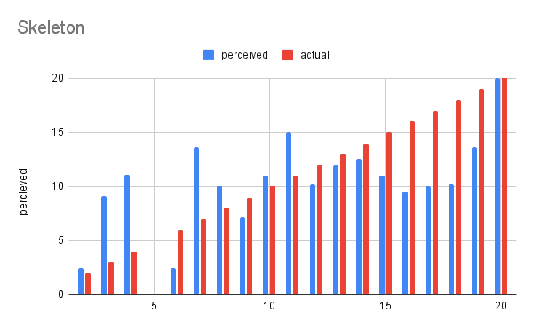
Despite the possible data corruption there were some interesting insights that I worked into our loading indicator rules. Skeleton loading indicators seemed to have a sweet spot in that 10–15 second range where users perceived the loading as much less than it was.
Lookback
What I liked
- Passively gathering data from a prototype using Supabase allowed me to continue other work while my test ran. I did not need to review user tests or moderate testing sessions.
- Using Framer overrides to create more realistic testing situations. The added randomness ensures I am gathering insight into their perception of that time spent.
What I learned
- How to connect a Framer prototype/site to Supabase.
- Quickly onboarding a user to your testing setup using an initial mock test. Without this test many of my first participants were confused.
What I would do differently
- I would push to get a budget to incentivize the participants to complete all three sections. This would have prevented the data disparity between linear and skeleton loading types.